Accessible and reusable accordion using only the <details> tag and CSS
Welcome to a new entry in my section dedicated to creating reusable and, above all, accessible components. This time, we are going to learn how to use the HTML <details> tag to create an accordion.
Repository: https://github.com/micaavigliano/accordion
Project: https://accordion-accessible.netlify.app/
To make our accordion accessible, we must take into account the following points
When the focus is on the accordion header, it must be possible to collapse and expand it by pressing the Enter or Space keys.
When pressing Tab, the focus moves to the next accordion or to the next interactive element inside the accordion.
When pressing Shift + Tab, the focus moves to the previous interactive element.
The screen reader must announce the state of the element, that is, whether it is collapsed or expanded. It must also announce its accessible name.
The <details> tag will help us meet all these points, since it is natively accessible by default.
How do we use the <details> tag?
The <details> tag is a native HTML structural tag used to create an element that can be expanded or collapsed. Inside this tag, we find the <summary> tag, which is used as a header acting as the control to expand or collapse the content. Finally, the content to be displayed is placed after the <summary> tag and can be any valid HTML element.
<details>
  <summary>Mostrar más</summary>
  <p>contenido</p>
</details>
Now that we have learned how the <details> tag is structured and what it is used for, we are going to create our reusable component.
First, let’s talk about the properties that the component will receive:
interface AccordionProps {
  title: string;
  children: ReactNode | string;
  icon: ReactNode | string;
  name?: string;
}titlewill be our header inside the<summary>tag.childrenwill be the content to display. It can receive either a string or a ReactNode.iconwill be the icon that replaces the native icon contained in the<details>element.nameis optional and will be the value assigned to thenameattribute, which we will talk about next.
name attribute
The <details> tag accepts the name attribute, which is used so that, if there is more than one <details> tag, the elements behave as a group. In other words, if one accordion is open and another is opened, the previously open one will automatically close.
How to remove the native arrow from the component
To remove the native arrow, we must keep two rules in mind: first, with the summary selector, we set list-style: none to remove the arrow in some browsers.
details summary {
  cursor: pointer;
  position: relative;
  list-style: none;
}
To remove the arrow in browsers like Chrome and Safari, we will use the -webkit-details-marker property.
details summary::-webkit-details-marker {
  display: none;
}
How do screen readers announce the <details> tag?
When the element is collapsed.
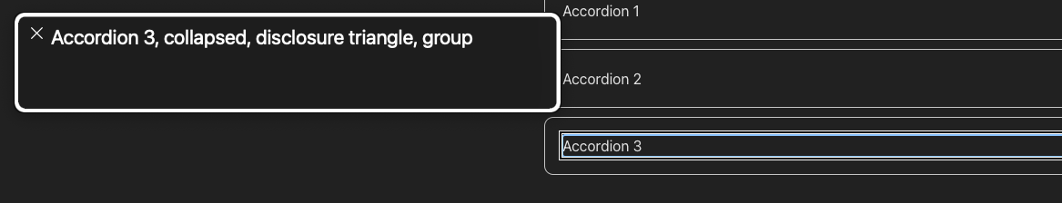
Screenshot of the VoiceOver screen reader announcing: Accordion 3, collapsed, group When the element is expanded.
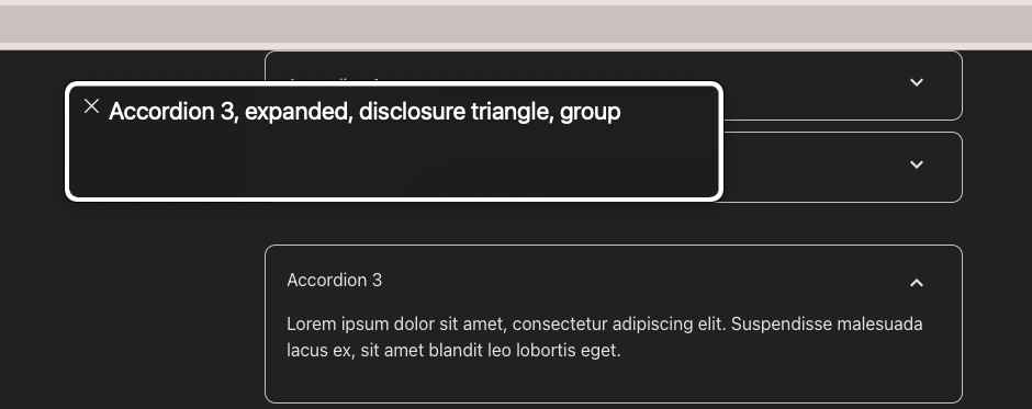
Screenshot of the VoiceOver screen reader announcing: Accordion 3, expanded, group
And that’s it! With all these changes and zero JavaScript, we now have a fully functional and 100% accessible accordion.
I hope this information is useful to you, and let me know if there’s anything in particular you’d like to learn about accessibility or if there’s any specific component that catches your attention so we can work on it in this section.