Accessible Components: Pagination
Micaela Avigliano
Frontend Engineer & Accessibility Engineer
Today, we're going to look at how to create pagination from scratch and make it accessible and reusable. I hope it’s helpful, and please leave your comments at the end of the post!
Github: https://github.com/micaavigliano/accessible-pagination
Project: https://accessible-pagination.netlify.app/
Custom hook to fetch data
Code block
const useFetch = <T,>(
  url: string,
  currentPage: number = 0,
  pageSize: number = 20) => {
  const [data, setData] = useState<T | null>(null);
  const [loading, setLoading] = useState<boolean>(true);
  const [error, setError] = useState<boolean>(false);
  useEffect(() => {
    const fetchData = async() => {
      setLoading(true);
      setError(false);
      try {
        const response = await fetch(url);
        if (!response.ok) {
          throw new Error('network response failed')
        }
        const result: T = await response.json() as T;
        setData(result)
      } catch (error) {
        setError(true)
      } finally {
        setLoading(false);
      }
    };
    fetchData()
  }, [url, currentPage, pageSize]);
  return {
    data,
    loading,
    error,
  }
};- We'll create a custom hook with a generic type. This will allow us to specify the expected data type when using this hook.
- We'll expect three parameters: one for the URL from which we'll fetch the data, currentPage, which is the page we're on (default is 0), and pageSize, which is the number of items per page (default is 20, but you can change this value).
- In our state const
[data, setData] = useState<T | null>(null);, we use the generic typeTsince, as we use it for different data requests, we'll be expecting different data types.
Pagination
To make pagination accessible, we need to consider the following points:
- Focus should move through all interactive elements of the pagination and have a visible indicator.
- To ensure good interaction with screen readers, we must correctly use regions, properties, and states.
- Pagination should be grouped within a
<nav>tag and contain anaria-labelidentifying it specifically as pagination. - Each item within the pagination should have an
aria-setsizeand anaria-posinset. Now, what are these for? Well,aria-setsizeis used to calculate the total number of items within the pagination list. The screen reader will announce it as follows:
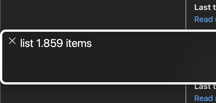
voiceover announcement: list of 1859 items aria-posinsetis used to calculate the position of the item within the total number of items in the pagination. The screen reader will announce it as follows:
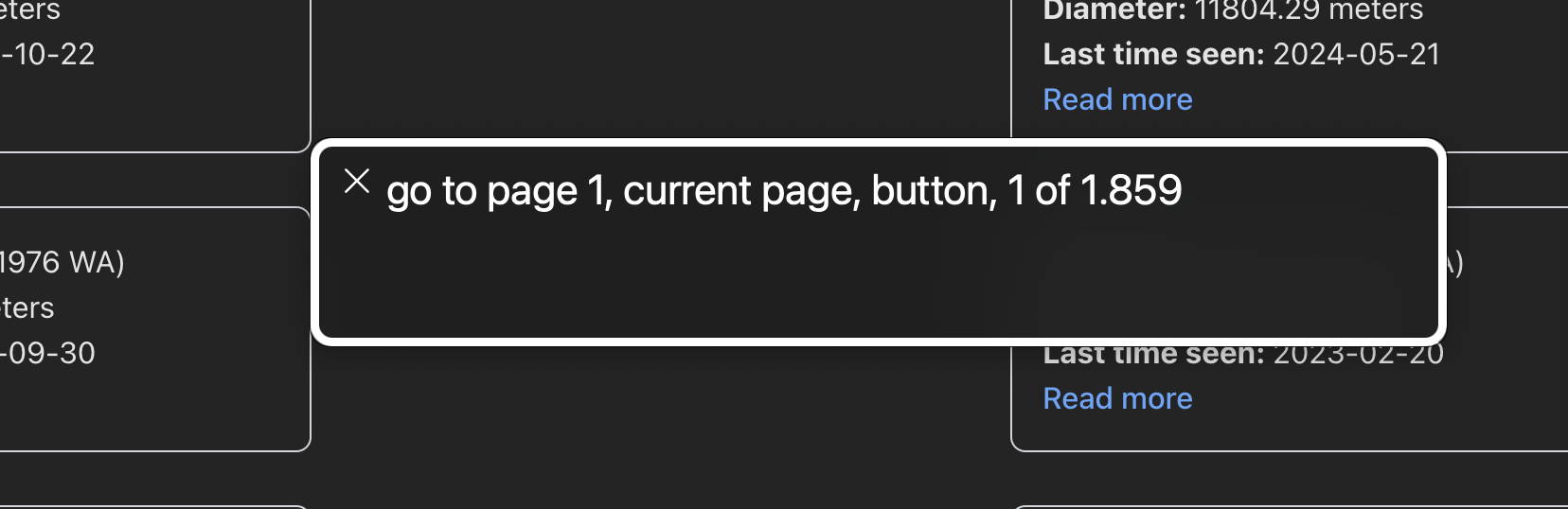
voiceover that announces: go to page 1. Current page, button, position 1 of 1859 - Each item should have an aria-label to indicate which page we’ll go to if we click on that button.
- Include buttons to go to the next/previous item, and each of these buttons should have its corresponding aria-label.
- If our pagination contains an ellipsis, it should be correctly marked with an aria-label.
- Every time we go to a new page, the screen reader should announce which page we are on and how many new items there are, as follows:
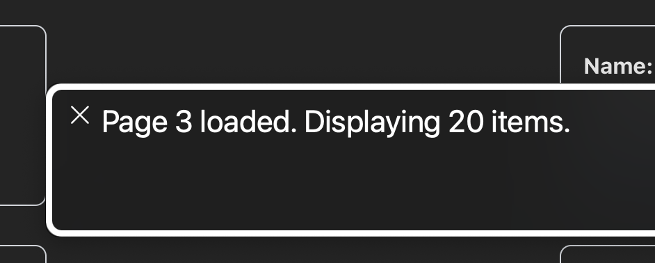
screen reader voiceover that announces: page 3 loaded. Showing 20 items


To achieve this, we’re going to code it as follows:
Code block
const [statusMessage, setStatusMessage] = useState<string>("");
useEffect(() => {
    window.scrollTo({ top: 0, behavior: 'smooth' });
    if (!loading) {
      setStatusMessage(`Page ${currentPage} loaded. Displaying ${data?.near_earth_objects.length || 0} items.`);
    }
 }, [currentPage, loading]);
When the page finishes loading, we’ll set a new message with our currentPage and the length of the new array we’re loading.
Code block
interface PaginationProps {
  currentPage: number;
  totalPages: number;
  nextPage: () => void;
  prevPage: () => void;
  goToPage: (page: number) => void;
}currentPagerefers to the current page. We’ll manage it within the component where we want to use pagination as follows:const [currentPage, setCurrentPage] = useState<number>(1);totalPagesrefers to the total number of items to display that the API contains.nextPageis a function that will allow us to go to the next page and update our currentPage state as follows:
Code block
const handlePageChange = (newPage: number) => {
    setCurrentPage(newPage);
  };

  const nextPage = () => {
    if (currentPage < totalPages) {
      handlePageChange(currentPage + 1);
    }
};prevPageis a function that will allow us to go to the page before our current page and update our currentPage state.
Code block
const prevPage = () => {
  if (currentPage > 1) {
      handlePageChange(currentPage - 1);
  }
};goToPageis a function that will need a numeric parameter and is the function each item will use to navigate to the desired page. We’ll make it work as follows:
Code block
const handlePageChange = (newPage: number) => {
    setCurrentPage(newPage);
};
To bring our pagination to life, we need one more step: creating the array that we’ll iterate through in our list! For that, we should follow these steps:
- Create a function; I’ll call it
getPageNumbersin this ocasion. - Create variables for the first and last items in the list.
- Create a variable for the left-side ellipsis. I’ve decided to place my ellipsis after the fourth item in the list.
- Create a variable for the right-side ellipsis. I’ve decided to place my ellipsis just before the last three items in the list.
- Create a function that returns an array with 5 centered items: the current page, two previous items, and two subsequent items. If needed, we’ll exclude the first and last pages.
Code block
const pagesAroundCurrent = [currentPage - 2, currentPage - 1, currentPage, currentPage + 1, currentPage + 2].filter(page => page > firstPage && page < lastPage);- For our final variable, we’ll create an array that contains all the previously created variables.
- Finally, we’ll filter out
nullelements and return the array
This array is what we’ll iterate through to get the list of items in our pagination as follows:
Code block
<ol className="flex gap-3">
  {pageNumbers.map((number) => {
    const isEllipsis = number === "left-ellipsis" || number === "right-ellipsis"
    if (isEllipsis) {
      return (
        <li
          key={number}
          className="relative top-5"
          aria-label="Ellipsis, more pages between"
        >
          <span aria-hidden="true">…</span>
        </li>
      )
    }
    const page = Number(number)
    const isCurrent = currentPage === page

    return (
      <li
        key={`page-${number}`}
        aria-setsize={totalPages}
        aria-posinset={typeof number === "number" ? page : undefined}
      >
        <button
          onClick={() => goToPage(page)}
          className={isCurrent ? "underline underline-offset-3 border-zinc-300" : undefined}
          aria-label={`Go to page ${page}`}
          aria-current={isCurrent ? "page" : undefined}
        >
          {page}
        </button>
      </li>
    )
  })}
</ol>
And that’s how to create a reusable and accessible pagination! Personally, I learned how to build pagination from scratch the hard way because I had to implement it in a live coding session. I hope my experience helps you in your career and that you can implement it and even improve it!
You can follow me on:
Linkedin: https://www.linkedin.com/in/micaelaavigliano/
Best regards,
Mica