Hotspots
Content
Open in Storybook: Hotspots (opens in a new tab)
Overview
It is a list of hotspots over particular places in an image. The hotspots are interactive elements that are being placed on the image based of coordinates. The hotspots can be one of three kinds: a link that shows a tooltip, a button that opens a non-modal dialog, and a button that opens a modal dialog. Every hotspot also has two shortcuts above the image: “View all”, which opens the same products as a list in a drawer inside the image, and a link that skips the whole hotspot component.
The structure of the component is: a ul with an accessible name that could be “Products in this image” and one li for each hotspot. The li can contain one of these interactions: Link: the hotspot is an a href named with the product, the price and where it goes. On hover and/or focus, it shows a tooltip, a popover="hint" that interestfor opens. Action: the hotspot is a button popovertarget for a dialog popover. On hover and/or focus, it opens the non-modal dialog without taking focus, and a press moves focus to its heading. Modal: the hotspot is a button command="show-modal" for a modal dialog and this is reserve for more complex scenarios.
Anatomy
Expand the disclosure elements and discover which part of the component it is explaining.
Image. The base
An
<img alt>is the base where the hotspots are placed.The image should contain the products to describe by the dots.It should have a descriptive alt explaining the whole scenario. The box has its shape from
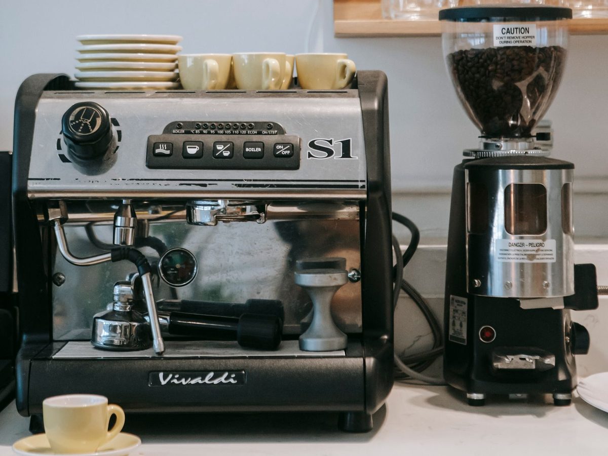
widthandheight, so a lazy image does not put the hotspots on a box of no height.<img src="kitchen.jpg" width="1200" height="900" alt="A kitchen counter with an espresso machine, yellow espresso cups on top of it and a coffee grinder beside it" />.wrapper-hotspot { position: relative; } .wrapper-hotspot > img { display: block; inline-size: 100%; block-size: auto; border-radius: 12px; object-fit: cover; }Interactive Hotspots
ul aria-label={accessible description of the products}>li>aorbuttonThis list will be a sibling of the base image and via CSS will be placed above it. It will be announced as a normal list: “list, 3 items”. Each hotspot is a 44px x 44px target placed by coordinates:
--xand--y. It could be one of the following kinds: a link, a button for a non-modal dialog, or a button for a modal modal. It is an icon-only element so it is mandatory to have an accessible name explaining its purpose and the dot icon hidden for AT and accessibility tree.<ul aria-label="Products in this image"> <li style="--x: 30%; --y: 42%"> <a href="/products/espresso-machine" interestfor="spot-1-tip"> <span class="hsp-dot" aria-hidden="true"></span> <span class="sr-only">Espresso machine, €129.00, go to the product page</span> </a> </li> </ul>ul { position: absolute; left: var(--x); top: var(--y); translate: -50% -50%; } a { inline-size: 2.75rem; block-size: 2.75rem; } .hsp-dot { inline-size: 1.875rem; block-size: 1.875rem; border: 2px solid currentColor; border-radius: 50%; }Tooltip, Modal Dialog or Non-modal Dialog
div popover="hint",dialog popoverordialogThe hotspot can open: a Tooltip of a link (a name, a price and an arrow, hidden from assistive technology), a Non-modal Dialog of an action (a quantity and “Add to bag”) or a Modal Dialog which contains the full product information.
There could be two widgets that might go with the hotspot component. Before the image, it could go two stops in the Tab order:
View all button that opens a drawer with every product as a list, so a user can reach any product without finding its hotspot.
Skip link, “Skip the products in this image”: it is a visually hidden link that is only visible when it receives focus, and it takes focus to the next interactive element after the component, so a keyboard or a screen reader user can bypass the whole component.
Usage
Use cases
Four different use cases implementing the different kinds of hotspots. Let's find them out.
A Link hotspot that manages a tooltip
The hotspot is the link and on hover or focus a tooltip appears with the product name and price but it is not reachable by assistive technologies or keyboard because the whole information of the product and the interaction is handled by the link (hotspot). When focused, the focus outline style is shared to the tooltip.
ulwith an accessible and descriptive name, like for example “Products in this image”, thenlis with ana hreffor each hotspot, the anchor should have the attributeinterestforlink it to the popover by the attributepopover="hint"with anaria-hiddenThe tooltip is inside the link, so pressing its words or its arrow follows the link, and a line under them says it is one. It stays
aria-hidden, so the name of the link is the same.On mobile, where the media query
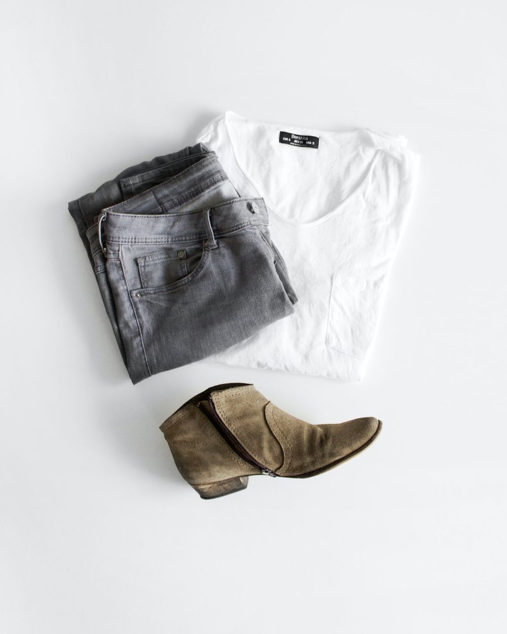
(hover: none)matches, the tooltip never opens and a tap on the link would leave before anyone read it. The hotspot is abutton popovertargetnamed “More info about White cotton tee, €29.00”, and thepopover="auto"is notaria-hidden: it has the name, the price and a “View details” link, a 44px target, which is the way to the page. It is after the button, since a button cannot hold a link, so a swipe or Tab goes from one to the other.A tap opens it and focus stays on the button. A tap outside, Esc or a tap on the hotspot again closes it, one is open at a time, and Esc gives focus back to the button.
Button that triggers a non-modal dialog
The hotspot is a button and on hover or focus, it opens a non-modal dialog with a quantity and “Add to bag”.
button popovertargetpointing todialog popover. It opens on hover and/or focus without taking focus, when clicking or Enter on it, the focus moves to its heading and Esc closes it. The main functionality of the non-modal dialog is that the focus is not trapped inside the dialog element, so the focus can move to the next element in the Tab order.Button that triggers a modal dialog.
The hotspot is a button that opens a modal dialog that contains the full product information and complex interactions. The modal dialog trapped the focus inside, so the page behind becomes inert. The modal dialog can be closed with Esc or Close button and the focus returns to the hotspot.
button command="show-modal" commandforlinked to thedialog.Many hotspots (6+) with a View all button
It might be confusing for some users to have lots of hotspots in the image, so adding a way to summarize them in a drawer would be an accessible solution to avoid overwhelming users.
A button above the image, the first Tab stop: “View all 6 products in this image” opens a drawer inside the image. When the drawer is open, Tab stays inside it and Esc and or Close button shut it and the focus goes back on the button.

Props
| Prop | Does | Default |
|---|---|---|
id | Required. Every id should be unique. | |
alt | The alt describes the whole scene. | |
aria-label on the ul | Describe the list of products. | |
hotspots | Object that contains: id, name, price, href, x and y (percent across and down), and description | |
kind | What a hotspot can be. It can be a link for a hotspot that is a link with a tooltip, action for a button that opens a non-modal dialog or modal for a button that opens a modal | link |
onFollow | Called when a link is followed: a hotspot, a link of the drawer, the link of a modal. A demonstration stops it from leaving | |
onAdd | If we have a quantity spinbutton, we should add onAdd function. It announces the state of the action by using ariaNotify(). | |
HotspotLevel | The level of the heading inside the dialogs. | 3 |
Code Example
import { Hotspot } from '@/components/Hotspot'

const spots = [
  {
    id: 'espresso-machine',
    name: 'Espresso machine',
    price: '€129.00',
    href: '/products/espresso-machine',
    x: 33, // percent across
    y: 55, // percent down
    thumb: '/images/espresso-machine.jpg',
    description: 'A 15-bar pump espresso machine with a steam wand.',
  }
]

export function Kitchen() {
  return (
    <Hotspot
      id="kitchen"
      src="/images/kitchen.jpg"
      alt="A kitchen counter with an espresso machine, yellow espresso cups on top of it and a coffee grinder beside it"
      width={1200}
      height={900}
      spots={spots}
      kind="action"                 // 'link' | 'action' | 'modal'
      onAdd={(spot, quantity) => addToBag(spot.id, quantity)}
    />
  )
}
Specs
Link managing a tooltip
The hotspot is the link so is the one having the semantic value for assistive technologies and managing the interaction. The tooltip is for the user who see it. It is just a visual aid.
| Rule | Detail |
|---|---|
| Link | a href in a li, 44px × 44px as a target size, with a hidden accessible name (2.5.3) and a explanation of its purpose. |
| Tooltip | div popover="hint", shown by interestfor on the link. It appears on hover and keyboard focus. |
| Arrow Icon | A decorative icon in the tooltip implying that it is a link and redirects the user to another location. |
| Focus | The ring of the hotspot and the ring of the tooltip are drawn together when the focus is visible: .hsp-item:has(.hsp-trigger:focus-visible) .hsp-tip |
| Tooltip Placement | The tooltip is anchored to the hotspot and it could be placed below, above, right or left depending the space available. |
Action opening a non-modal dialog
The hotspot is a button, because pressing it does something: it opens a non-modal dialog with what is needed to buy the product. It is the Non-modal Dialog of the design system, as a popover.
| Rule | Detail |
|---|---|
| button | button popovertarget linked to a dialog popover, so the dialog is next in the Tab order and the button says it is expanded |
| Hover and focus | The non-modal dialog is opened with showPopover(). The focus remains on the button. |
| Press the button | When the non-modal dialog is open already, Enter, Space or a click moves focus to its heading and does not close it. When it is shut, the declarative toggle opens it and focus goes to the heading. |
| Non-modal dialog | The name as a heading, Close button, the close-up picture of the product, the price and a form: a quantity and “Add to bag”. The focus is not trapped. |
| Closes | Esc, Close button, a click outside (light dismiss), the pointer or focus leaving after 150ms. |
| Esc and focus | Focus goes back to the hotspot, the non-modal dialog is closed, the focus returns to the button thanks to the beforetoggle attribute and if the user wants to open the non-modal dialog, the button should be pressed again. |
| Non-modal dialogPlacement | The tooltip is anchored to the hotspot and it could be placed below, above, right or left depending the space available. |
| Add to bag | Calls onAdd(spot, quantity) and says “Added 3 Espresso machine to the bag” once with ariaNotify() attached to the button |
A hotspot button opening a modal dialog
The hotspot is a button, because pressing it does something: it opens a modal dialog. A modal dialog is for the full product description and more complex interactions.
| Rule | Detail |
|---|---|
| button | button command="show-modal" commandfor and a dialog, the Modal Dialog of the design system, after the list |
| Opens on | Clicking by the mouse or pressing Enter or Space. |
| Focus | Moves to the heading. The focus is trapped inside the modal. Esc and Close button return focus to the hotspot |
| Contains | The name as a heading, Close button, the picture, the price, the description, the quantity, “Add to bag” and the link to the page of the product |
| Page behind | Inert |
| Close | button command="close" commandfor, Esc, or closedby |
Shortcuts above the image
Two controls, before the image and before any hotspot. For a keyboard or a screen reader user they are the first two stops of the Tab order, and they are the same whatever the kind.
| View all | Skip | |
|---|---|---|
| Element | button type="button", the secondary button of the design system | a href="#id-end" |
| Name | “View all 3 products in this image”: verb, count and object | “Skip the products in this image” |
| Order | First Tab stop of the component | Second, then the first hotspot |
| Seen | Always, above the image | Visible only when receives focus. It stays in the Tab order and on the accessibility tree |
| Does | Opens the drawer; aria-expanded and aria-controls. | Takes focus to the next interactive element in the document after the component. |
View all products drawer
A modal dialog inside the image styled as a drawer. It traps focus while it is open. Esc and Close button always shut it. In it, each product has what its hotspot has.
| Rule | Detail |
|---|---|
| button | Opens the drawer |
| Opens | On a press of “View all”, the drawer opens and focus goes to its title |
| Focus on open | The title (tabindex="-1"), so a screen reader says where it is |
| Contains | Close button, and a list of every product. |
| Link | Each product is a card with a link to its page, named like the card |
| Action | Each product has an “Add to bag” |
| Focus trap | Tab on the last control goes to Close, Shift+Tab on Close to the last control, on the document. |
| Closes | Esc, Close button and the focus goes back to the button that opened it. |
States
| State | Look |
|---|---|
| Default | 30 px ring, 2 px ink, 10 px dot; 44 × 44 target. |
| Hover | Tint fill under @media (hover: hover). |
| Focus | The site ring outside the ring; for a link, round the tooltip as well. |
| Open | Fill inverts: :has(:popover-open). |
| Forced colors | Border and dot in system colours. |
| Tooltip | Ink bubble, white text, an arrow; closed it is display: none. |
| Dialog | The states of the Non-modal Dialog and of the Modal Dialog of the system. |
Parts
| Part | Element | Rule |
|---|---|---|
| View all | button above the image, aria-expanded, aria-controls | The first Tab stop. |
| Skip link | a href before the image | The second Tab stop. Visible only when focused and it takes focus to the next interactive element in the document after the image. |
| Image | img with alt describing the scene | Description of the context |
| Drawer | dialog as a modal dialog inside the image | It is a modal-dialog only existing in the image. |
| Spots | ul aria-label="Descrbing the list of products" > li | The count is announced: “list, 3 items”, for example |
| Spot as a link | a href, 44px × 44px, interestfor | Named by hidden text that says where it goes |
| Spot as an action | button type="button" popovertarget | Named by hidden text that says what it does |
| Spot as a modal | button type="button" command="show-modal" commandfor | Named by hidden text |
| Tooltip | div popover="hint" aria-hidden="true" | A name, a price and an arrow automatically and it is hidden from assistive technologies |
| Dialog | dialog popover | The Non-modal Dialog of the system, anchored to the hotspot |
| Modal | dialog, command="close" | The Modal Dialog of the system |
| Thumbnail | img alt="" | The heading already names the product |
Markup of the link
The two shortcuts and the drawer are the same for the three kinds, and are after the three.
<a
  href="/products/white-cotton-tee"
  class="hsp-trigger"
  style="anchor-name: --tee"
  interestfor="tee-tip"
>
   <span class="hsp-dot" aria-hidden="true"></span>
   <span class="sr-only">White cotton tee, €29.00, go to the product page</span>
</a>.hsp-trigger[interestfor] { interest-delay: 0.1s 0.25s; }
.hsp-tip {
inset: auto; margin: 0.5rem;
position-area: bottom;
position-try-fallbacks: top, right, left;
background: var(--ink); color: var(--white); border-radius: 8px;
}
.hsp-item:has(.hsp-trigger:focus-visible) .hsp-tip {
box-shadow: 0 0 0 3px var(--focus-ring-soft), 0 0 0 7px var(--focus-ring-primary);
}Markup of button opening a non-modal dialog
<button
  type="button"
  class="hsp-trigger"
  popovertarget="espresso-dialog"
  style="anchor-name: --espresso"
>
 <span class="hsp-dot" aria-hidden="true"></span>
 <span class="sr-only">View options for Espresso machine, €129.00</span>
</button>
<dialog
  id="espresso-dialog"
  popover
  class="nmd nmd--anchored nmd--compact hsp-dialog"
  aria-labelledby="espresso-title"
  style="position-anchor: --espresso"
>
  {...}
</dialog>
Markup of button opening a modal dialog
<button
  type="button"
  class="hsp-trigger"
  command="show-modal"
  commandfor="tee-modal"
>
 <span class="hsp-dot" aria-hidden="true"></span>
 <span class="sr-only">View details for White cotton tee, €29.00</span>
</button>

<dialog
  id="tee-modal"
  class="app-dialog hsp-modal"
  closedby="any"
  aria-labelledby="tee-modal-title"
>
  {...}
</dialog>
Guidelines
Link, action or modal?
The decision of what element the hotspot is depends on what we want it to do.
| We want to | Use |
|---|---|
| Go to the page of the product | Link: the hotspot is a link, and the tooltip says what it is |
| Choose a quantity and add the product without leaving the image | Action: a button that opens a non-modal dialog |
| Read about the product and decide: sizes, details, a task that needs the whole attention | Modal: a button that opens a modal |
Hotspots or something else?
Hotspots point at things inside an image. When the image does not need to be pointed at, a list is simpler.
| Need | Use |
|---|---|
| Products placed in a photo (lookbook, room, kitchen) | Hotspots over the image. |
| Products where the position adds nothing | A product list or grid under the image |
| A single destination for the whole image | A link around the image, not hotspots |
| Parts of a diagram explained in text | A figure with figcaption and a list. Hotspots only if position matters |
| A guided tour of features | A stepper or a disclosure list |
Accessibility
Keyboard
Tab order of every interactive element.
| Key | Context | Action |
|---|---|---|
| Tab | Page | First “View all”, then “Skip”, then the hotspots |
| Tab | Link focused | Shows the tooltip, with the ring round both. The focus stays on the link. Tab moves on to the next hotspot |
| Enter | Link focused | Follows it to the product page |
| Escape | Tooltip open | Closes it and leaves focus on the link |
| Tab | Action focused | Opens the dialog without taking focus. |
| Tab | Action focused | When the dialog is open, the Tab goes into it and all the interactive elements inside of it become part of the focus flow. The focus is not trapped. |
| Enter | Quantity field | Adds or removes items |
| Escape | Dialog open | Closes it, focus on the hotspot, and it does not open again |
| Enter or Space | Modal hotspot | Opens the modal, focus on its heading |
| Tab or Shift+Tab | Modal open | Goes round inside it an never leaves because of the focus trap. |
| Escape | Modal open | Closes it, focus on the hotspot |
| Enter or Space | View all | Opens the drawer and places the focus on its title. |
| Tab | Drawer | Close button, then each product, then back to Close button because of the focus trap. |
| Shift+Tab | Drawer | Close goes to the last product; so does the title, where focus starts |
| Tab or Shift+Tab | Focus outside the drawer while it is open | Tab goes in at Close button, Shift+Tab at the last product. |
| Escape | Drawer | Closes it, focus on “View all” |
| Enter | Skip | Focus to the next interactive element after the image. |
WCAG criteria
What each success criterion asks of hotspots, and what meets it.
- 1.1.1 Non-text Content (A) (opens in a new tab)
- 1.3.1 Info and Relationships (A) (opens in a new tab)
- 1.3.2 Meaningful Sequence (A) (opens in a new tab)
- 1.4.10 Reflow (AA) (opens in a new tab)
- 1.4.11 Non-text Contrast (AA) (opens in a new tab)
- 1.4.13 Content on Hover or Focus (AA) (opens in a new tab)
- 2.1.1 Keyboard (A) (opens in a new tab)
- 2.1.2 No Keyboard Trap (A) (opens in a new tab)
- 2.4.1 Bypass Blocks (A) (opens in a new tab)
- 2.4.3 Focus Order (A) (opens in a new tab)
- 2.4.4 Link Purpose (In Context) (A) (opens in a new tab)
- 2.4.7 Focus Visible (AA) (opens in a new tab)
- 2.4.11 Focus Not Obscured (Minimum) (AA) (opens in a new tab)
- 2.5.3 Label in Name (A) (opens in a new tab)
- 2.5.8 Target Size (Minimum) (AA) (opens in a new tab)
- 3.2.1 On Focus (A) (opens in a new tab)
- 4.1.2 Name, Role, Value (A) (opens in a new tab)
Related
- Button (opens in a new tab)
- Modal Dialog (opens in a new tab)
- Non-modal Dialog (opens in a new tab)
- Quantity (opens in a new tab)
References
This section is still in progress.