Video player
Media
Open in Storybook: Video player (opens in a new tab)
Overview
The video player is built on the native video tag, or audio for a sound with no picture, and on native form controls: buttons, two ranges and a select. The controls attribute is not used. Playback is driven through a ref, so every control can be named, styled and tested.
The captions are drawn outside the player, as ordinary text, so they zoom and wrap like any text and never cover the controls. The track is kept hidden: the browser loads it, fires its cues and draws nothing.
One DOM, three bars. The bar answers to the room the player has, in a container query: over the picture with every control, over the picture with fewer, or below the picture and wrapped. The thumbnail of a card is VideoThumbnail, a component of its own, because a card chooses it and the width of a page does not.
Informational video with sound never autoplays. autoplay, loop and muted belong only to decorative video and to clips with no sound.
Anatomy
- Picture
video,audiowith nocontrolsDriven by a ref. Holds the source and the tracks. A click on it plays and pauses; it is not a tab stop, because the controls are always shown.
- Play/Pause
button aria-label="Play video"The name changes with the state: “Pause video”. The icon is
aria-hidden. - Mute
button aria-label="Mute"Becomes “Unmute” at 0. Unmuting brings the last volume back, or full volume if it was 0.
- Volume
input type="range" min="0" max="10" aria-label="Volume"Read as a percent through
aria-valuetext: “70% volume”. Arrow keys move it 10%. - Current time
time aria-hidden="true"The visible clock. Hidden so a parked screen-reader cursor does not read it again.
- Seek
input type="range" aria-label="Seek"Says “13 seconds of 52 seconds” through
aria-valuetext. Its value does not follow the video while a keyboard has it. - Remaining time
time aria-hidden="true"Visual only. The slider already says the position and the length.
- Captions toggle
button aria-pressed aria-label="Captions"Name “Captions”.
aria-pressedcarries on and off, so the name never changes. - Caption language
select aria-label="Caption language"One option for each
track, named in its own language. Shown for more than one. - Full screen
button aria-label="Enter full screen"Asks the whole player, so the bar and the captions stay on screen. “Exit full screen” when on.
- Captions
sectionwith apThe active cue as ordinary text, outside the player. The track mode is
hidden.
Usage
Use cases
Functional elements where you can play, pause, seek, mute and open each design. Every video is cut from Sintel, an open movie.
Audio-only content
Podcast or audio guide without picture: same controls, no captions toggle. A transcript is required (1.2.1) and its button is right below the player.
Sintel · The trailer, sound only
audiowith nocontrols, the samediv role="group", a transcriptbuttonDecorative hero, 5 s or more
Muted,
aria-hidden, not focusable. Autoplay allowed. A visible Pause control is required.Open movie
Meet Sintel and her dragon
video muted autoplay loop aria-hidden="true" tabindex="-1",button“Pause background video”Decorative hero · reduced motion
prefers-reduced-motion: the video is replaced by a static image. No Pause needed.
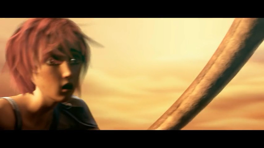
Open movie
Meet Sintel and her dragon
img alt="", novideo, no buttonDecorative micro-loop, under 5 s
Muted and hidden from AT. Pause not required. Hidden under reduced motion.
A dragon in flight
Small loop next to the title. No controls: it lasts under 5 seconds and is hidden from assistive tech.
video muted autoplay loop aria-hidden="true", no controlsInformational, dialogue + audio, 5 s or more
No autoplay: the user starts it. Captions and a recommended transcript.
track kind="captions",button aria-pressed,selectfor the language, transcriptbuttonInformational, dialogue + audio, under 5 s
Same rules even if short: no autoplay with sound, captions required.
I'm searching for someone.
track kind="captions", noautoplayMeaningful sound, no dialogue
Manual play. Captions describe the sounds; never label them “subtitles”.
[music]
track kind="captions"with “[music]”, noautoplaySilent but meaningful, 5 s or more
No sound, so no mute or captions. Transcript or audio description required, a button below.
track kind="descriptions",button aria-pressed“Audio description”, transcriptbuttonSilent but meaningful, under 5 s
Muted autoplay allowed; Pause optional. Short description below; hidden under reduced motion.
A young woman reaches out her hand as a small dragon flies past.
video muted autoplay, apthat says what it showsComplex visuals + audio
No autoplay. Captions plus an audio description track (or extended transcript).
What brings you to the land of the gatekeepers?
track kind="captions"andtrack kind="descriptions",button aria-pressed“Audio description”Thumbnails in cards
The Play button is its own control, not nested in the card link. Its accessible name carries the title and duration. Play opens the full player in a modal dialog, and the guide opens in a drawer.
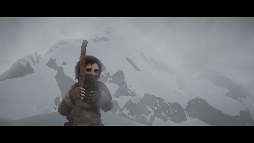
Sintel, the trailer
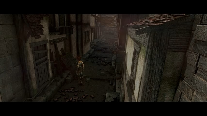
Sintel, searching for someone
Sintel, a dragon in the sky
button aria-haspopup="dialog" aria-label="Play video: Sintel, the trailer, 52 seconds"
Props
| Prop | Does | Default |
|---|---|---|
src · label | The file, and the name of the player as a whole | Required |
media | video, or audio for a sound with no picture: a dark panel, a title, no captions, no full screen | video |
title | The title above the bar of an audio player | — |
languages | One track kind="captions" each: code, label, src. None means no Captions button | None |
languageSelect | The language select, forced on or off | More than one language |
descriptions | A track kind="descriptions". Adds the Audio description button, and each new description is shown as text and said with ariaNotify() | None |
silent | A video with no sound: no Mute and no Volume | false |
transcript | The button below the player that opens the text in a drawer: label, title, text and side, left or right | None |
note | Words under a silent video that say what it shows | — |
startAt · captionsOn · audioDescriptionOn | Where it starts in seconds, and the choices a person has already made | 0 · false · false |
autoPlay | Muted autoplay, for a clip with no sound only | false |
| Component | What it is | Props |
|---|---|---|
VideoControlButton | The 44 × 44 button of the bar, with its icon | icon, label, pressed |
VideoThumbnail | The picture of a video in a card: one Play button that opens the player in a modal dialog | title, duration, poster, captions, player |
VideoTextDrawer | A button that opens a text in a drawer, from the left or the right: the transcript below a player, the guide of a card | label, title, text, side, icon |
DecorativeVideo | A background loop: muted, hidden, with Pause when it moves for 5 seconds or more | src, poster, pausable, whenReduced, reducedMotion |
Example
The player is as wide as its slot and answers to it. Give the slot the width, never the player.
import { VideoPlayer } from '@/components/VideoPlayer'

<VideoPlayer
  src="/sintel-trailer.mp4"
  label="Sintel, official trailer"
  languages={[
    { code: 'en', label: 'English', src: '/trailer-en.vtt' },
    { code: 'it', label: 'Italiano', src: '/trailer-it.vtt' },
  ]}
  transcript={{
    label: 'Read the transcript',
    title: 'Transcript: Sintel, official trailer',
    text: transcript,
  }}
/>
Specs
States
| State | Picture | Bar |
|---|---|---|
| Paused, before playback | The poster circle. No autoplay for video with sound | Play/Pause shows Play |
| Playing | The video | Pause shows. The clock and the fill follow it |
| Captions on | The cue is text below the picture | Captions is pressed: a lighter fill and a bar under the icon |
| Focus on a control | — | A 3px white ring. The seek slider has the ring as a border |
| Muted | — | The button reads Unmute and the volume slider is at 0 |
| Audio only | None: a dark panel with the title | The same bar, without Captions or Full screen |
| Text at 200%, 400% zoom | Unchanged | Below the picture and wrapped. Every control stays at 44px or more |
Tokens
Component tokens
| Part | Property | Token | Value |
|---|---|---|---|
| Bar over the picture | Fill | ink | #16161a at 88% |
| Bar below the picture, cue, select | Fill | ink | #16161a |
| Poster, thumbnail badges | Fill | ink | #16161a at 85% and 90% |
| Picture | Fill until it draws | fill | #f3f3f5 to #2c2c33 |
| Control button | Hover · pressed | — | White at 16% · white at 24% |
| Controls, times, cue | Text and icons | — | #ffffff, on a dark surface |
| Focus | Ring | — | 3px #ffffff. It replaces the blue site ring inside the bar |
| Track | Fill | — | White at 35%, and white for the part played |
| Transcript link | Text | lilac-deep | #3d3459 |
| Note, description | Text | ink-soft | #4b4b55 |
| Card | Border · fill | line · card | #d7d7dc · #ffffff |
Guidelines
Controls by scenario and context
Each row is one scenario. Each column shows the control bar that design gets. Bars are scaled-down copies of the real controls (the control button is the component itself). Desktop uses the Large bar, smaller viewports the Medium bar or the thumbnail, and zoom the reflow layout.
- Solid: required in that context, never dropped
- Dashed: optional, or only if there is room (otherwise in the expanded player)
- Transcript linkOutside the player, below it
Zoom 400% · 320 CSS px. At 200% text size the desktop bar stays and wraps.
Decorative hero, 5 s or more
Background video in the header
- Desktop · 640 px and upSize=Large
Pause
Pause only. Video is muted and aria-hidden. Name: “Pause background video”.
- Smaller viewport · 400–639 pxSize=Medium · in cards: Thumbnail
Pause
Same Pause button. Never dropped: 2.2.2.
- Zoom 400% · 320 CSS pxReflow layout
Pause
Same button, 44×44 at 1×. After reflow it must not cover the heading. Reduced motion: static image, no button.
Decorative micro-loop, under 5 s
Small loop by a title
- Desktop · 640 px and upSize=Large
No controls
Muted, aria-hidden, autoplay allowed. Under 5 s, so 2.2.2 needs no Pause.
- Smaller viewport · 400–639 pxSize=Medium · in cards: Thumbnail
No controls
Same.
- Zoom 400% · 320 CSS pxReflow layout
No controls
Same. Reduced motion: hidden or first frame only.
Informational, dialogue + audio, 5 s or more
Tutorial or interview
- Desktop · 640 px and upSize=Large
Play/Pause · Seek · Time · Mute · Volume · Captions · Caption language · Full screen
Transcript
Every control. No autoplay. Captions outside the player. Transcript link below (recommended).
- Smaller viewport · 400–639 pxSize=Medium · in cards: Thumbnail
Play/Pause · Seek (if room) · Time (if room) · Mute · Captions · Expand
Card → Thumbnail
Medium: Play, Mute, Captions, Expand always. Seek and time only if room. In a card under 400 px: Thumbnail, Play opens the dialog.
- Zoom 400% · 320 CSS pxReflow layout
Play/Pause · Mute · Captions · Expand · Seek (if room) · Time (if room)
320 CSS px: required buttons on row 1, seek on its own row. Volume and caption language go to full screen. Captions wrap below.
Informational, dialogue + audio, under 5 s
Short tagline with voice-over
- Desktop · 640 px and upSize=Large
Play/Pause · Seek · Time · Mute · Volume · Captions · Caption language · Full screen
Identical to the 5 s+ row. Being short removes nothing: captions still required.
- Smaller viewport · 400–639 pxSize=Medium · in cards: Thumbnail
Play/Pause · Seek (if room) · Time (if room) · Mute · Captions · Expand
Identical to the 5 s+ row.
- Zoom 400% · 320 CSS pxReflow layout
Play/Pause · Mute · Captions · Expand · Seek (if room) · Time (if room)
Identical to the 5 s+ row.
Informational, meaningful sound, no dialogue
Coffee machine hissing demo
- Desktop · 640 px and upSize=Large
Play/Pause · Seek · Time · Mute · Volume · Captions · Full screen
Captions describe sounds: [steam hissing]. Caption language only if the sound captions are translated.
- Smaller viewport · 400–639 pxSize=Medium · in cards: Thumbnail
Play/Pause · Seek (if room) · Time (if room) · Mute · Captions · Expand
Play, Mute, Captions, Expand always.
- Zoom 400% · 320 CSS pxReflow layout
Play/Pause · Mute · Captions · Expand · Seek (if room) · Time (if room)
Same wrap as dialogue. Sound captions stay readable below.
Informational, silent but meaningful, 5 s or more
Product shown visually, no sound
- Desktop · 640 px and upSize=Large
Play/Pause · Seek · Time · Audio description · Full screen
Transcript
No audio track, so no Mute, Volume or Captions. AD toggle if there is an AD track; transcript always.
- Smaller viewport · 400–639 pxSize=Medium · in cards: Thumbnail
Play/Pause · Seek (if room) · Time (if room) · Audio description · Expand
Transcript
Play, AD, Expand always. Transcript stays below the player.
- Zoom 400% · 320 CSS pxReflow layout
Play/Pause · Audio description · Expand · Seek (if room) · Time (if room)
Transcript
Required buttons on row 1. Transcript reflows below.
Informational, silent but meaningful, under 5 s
Short animation showing a feature
- Desktop · 640 px and upSize=Large
Pause (optional)
Description
Muted autoplay allowed; Pause optional. Short text description next to it.
- Smaller viewport · 400–639 pxSize=Medium · in cards: Thumbnail
Pause (optional)
Description
Same. If Pause is shown it keeps 44×44.
- Zoom 400% · 320 CSS pxReflow layout
Pause (optional)
Description
Same. Reduced motion: static frame plus the description.
Informational, complex visuals + audio
Product video with dense visuals and narration
- Desktop · 640 px and upSize=Large
Play/Pause · Seek · Time · Mute · Volume · Captions · Caption language · Audio description · Full screen
Extended transcript
Everything in the dialogue row plus the AD toggle (or an extended transcript).
- Smaller viewport · 400–639 pxSize=Medium · in cards: Thumbnail
Play/Pause · Seek (if room) · Time (if room) · Mute · Captions · Audio description · Expand
Play, Mute, Captions, AD, Expand always. Seek and time only if room.
- Zoom 400% · 320 CSS pxReflow layout
Play/Pause · Mute · Captions · Audio description · Expand · Seek (if room) · Time (if room)
Five required buttons on row 1, seek on row 2.
The component differs from the matrix in two places: from 336px, not 400px, its Medium bar is over the picture, so the player of a card or a phone keeps its controls with the video; and at 320 CSS px it wraps Volume and Caption language into the bar, as the reflow design draws it, instead of moving them to full screen.
Content
| Part | Name or text | Value text |
|---|---|---|
| Play/Pause | “Play video” · “Pause video” | — |
| Mute | “Mute” · “Unmute” | — |
| Volume | “Volume” | “70% volume” |
| Seek | “Seek” | “13 seconds of 52 seconds”. Units are spelled out: “1:05” and “1:50” sound alike |
| Captions · language · description | “Captions” · “Caption language” · “Audio description” | — |
| Full screen | “Enter full screen” · “Exit full screen” | — |
| Thumbnail Play | “Play video: Sintel, the trailer, 52 seconds”. The title and the duration | — |
| Close | “Close video” on the dialog of a thumbnail · “Close” on a drawer | — |
| Decorative Pause | “Pause background video”, with the visible text “Pause background” | — |
| Transcript, guide | “Read the transcript” · “Extended transcript with visual descriptions” · “Read the guide”. The drawer is headed “Transcript: Sintel, official trailer” | — |
Behavior
| Event | Result |
|---|---|
| Play is pressed | It plays and the name becomes “Pause video”. Focus stays on the button |
| The picture is clicked | It plays or pauses. It is a pointer shortcut: the button is the keyboard way |
| Volume is taken to 0 | It is muted, and the button reads Unmute |
| Unmute | The last volume comes back, or full volume if the slider was at 0 |
| An arrow on Seek | One second, either way. The value is held while a keyboard has the slider and the video plays |
| Captions on | The cue is text below the picture. Changing the language changes the cue and keeps the toggle |
| Audio description on | Each new description is shown as text and said once with ariaNotify() from the player |
| The transcript or the guide is pressed | A modal drawer opens from the left or the right, with focus on its heading. Esc, Close or a click outside shuts it and focus goes back to the button |
| Play on a thumbnail | A modal dialog opens with the Large player, focus on Play/Pause, and the video starts |
| Esc or Close on that dialog | It closes, the video pauses and keeps its place, and focus goes back to Play |
| Reduced motion | A decorative hero is a still image with no button. A micro-loop is not there |
Accessibility
Keyboard
Every control is native, so no key is handled by script except the seek arrows, which keep a fine step for a smooth thumb and jump a whole second. Seeking by keyboard means no dragging is needed.
| Key | Action | Native |
|---|---|---|
| Tab, Shift+Tab | Play/Pause, Mute, Volume, Seek, Captions, Caption language, Audio description, Full screen, in that order. Hidden controls are not stops. The picture is not a stop | Yes |
| Enter, Space | Activates the focused button. A toggle keeps its focus | Yes |
| Left, Right, Up, Down | Seek: one second. Volume: 10%. Caption language: the next option | Seek no · Volume yes · Select yes |
| Home, End | Volume: 0% and 100% | Yes |
| Esc | Closes the dialog of a thumbnail or the drawer of a transcript and returns focus to its button. Leaves full screen: the browser does it | Yes |
Roles and properties
| Part | Exposed | Note |
|---|---|---|
| Player | A figure named by aria-label | “Sintel, official trailer” |
| Controls | group named “Media controls” | A div. A ul role="group" with li fails the axe rule listitem, so there is no list |
| Buttons | button, named by aria-label | The icon is aria-hidden and focusable="false" |
| Captions, Audio description | aria-pressed | The name stays the same: the state is the property |
| Seek, Volume | slider with aria-valuetext | No aria-valuenow: the native value is read |
| Times | Nothing | aria-hidden. The sliders say the position and the length |
| Transcript, guide | A button with aria-haspopup="dialog" that opens a modal dialog | Named by its heading, which takes focus. It is the system drawer, from either side |
| Cue, description | Text | Not live regions. The description is also said with ariaNotify() |
The silent seek slider
Two values do two jobs. The clock and the fill follow the video on every frame. The value of the slider is what a screen reader reads, and it must not follow the video, or the position would be read all the time. While a keyboard has the slider and the video plays, its value is held; it changes on focus and on a seek.
| Moment | Slider value | Said |
|---|---|---|
| The slider gets keyboard focus | Snapshot of the current time | “13 seconds of 52 seconds”, once |
| The video plays on | Held | Nothing. The clock and the fill move |
| An arrow is pressed | The new time | The new position, once |
| Mouse or touch focus | Follows the video | Nothing is said by the slider |
Zoom and text size
| Criterion | What the player does |
|---|---|
| Text at 200% | Size, controls, times and captions are in rem, so they grow with the text. The bar moves below the picture and wraps, and the seek bar gets its own row. Nothing is truncated, overlaps or is hidden |
| Reflow at 400% | 1280px at 400% is 320 CSS px. One column: picture, controls, captions. No horizontal scroll. Every control stays available and 44 × 44px or more, and none moves into a menu |
| Text spacing | No fixed height on the bar or the cue, so labels, times and captions do not clip |
| Captions while zoomed | They are outside the player, so they wrap freely and never cover the controls |
Announcements
A native control says its own name, role and value, so most of the player needs no announcement. What changes without a control being touched is said once with ariaNotify() from the player, never through a live region. The method puts nothing in the DOM: where a browser does not have it nothing is said, and the same words are on the page as text.
| Event | Said by | Announced | Priority |
|---|---|---|---|
| Volume changes | The slider, natively | “80% volume” | — |
| Mute | The button, by its name | “Unmute” | — |
| Focus on Seek | The slider, natively | “13 seconds of 52 seconds”, once | — |
| The video plays | Nothing | Silence. The clock and the fill move, the value of the slider is held | — |
| A new audio description | ariaNotify() from the player | The text of the cue, also on the page | normal |
| A caption cue | Nothing | It is text on the page, outside the player. A screen reader reads it when asked | — |
The rules of ariaNotify(), as the system uses it.
- One call for each event, after the DOM and the focus have changed.
- Called on the player: an element that is in the accessibility tree and stays.
- Priority
normal.highis for what interrupts, like an error. - The voice follows the
langof the element it is called on. - Feature-detected: where the method is missing nothing is said, and no live region takes its place.
- Never
role="status",role="alert"oraria-live.
if ('ariaNotify' in Element.prototype) {
  player.ariaNotify(cue.text, { priority: 'normal' })
}
WCAG criteria
Every criterion the player answers to, once, with its level and where the player meets it. The other sections say what the player does, not which criterion it is.
| Criterion | Level | Requirement here |
|---|---|---|
| 1.2.1 Audio-only and Video-only (Prerecorded) | A | Audio only has a transcript: a button below the player opens it |
| 1.2.2 Captions (Prerecorded) | A | A Captions toggle and a track, outside the player, with the sounds that matter |
| 1.2.3 Audio Description or Media Alternative (Prerecorded) | A | An Audio description button and track, or a transcript |
| 1.2.5 Audio Description (Prerecorded) | AA | An audio description track for a video whose visuals carry meaning |
| 1.4.2 Audio Control | A | Pause and Mute, never dropped. A thumbnail never plays sound and a decorative video is muted |
| 1.4.4 Resize Text | AA | Sizes in rem: the bar, the times and the captions grow with the text |
| 1.4.10 Reflow | AA | One column at 320 CSS px, with every control, and no horizontal scroll |
| 1.4.11 Non-text Contrast | AA | White on ink for the icons, the ring and the track |
| 1.4.12 Text Spacing | AA | No fixed height on the bar or the cue |
| 1.4.13 Content on Hover or Focus | AA | Nothing appears on hover or focus: the bar is always shown |
| 2.1.1 Keyboard | A | Every control is native. The two sliders take the arrows |
| 2.2.2 Pause, Stop, Hide | A | Play/Pause, and Pause on a decorative video of 5 s or more |
| 2.4.3 Focus Order | A | The source order, in every layout. The dialog and the drawers return focus to their button |
| 2.4.7 Focus Visible | AA | A 3px white ring on every control of the bar |
| 2.5.7 Dragging Movements | AA | Seeking and volume by the arrows, no dragging |
| 2.5.8 Target Size (Minimum) | AA | 44 × 44px for every control, at every size |
| 3.3.2 Labels or Instructions | A | A name on every control |
| 4.1.2 Name, Role, Value | A | The state in aria-pressed and aria-valuetext |
| 4.1.3 Status Messages | AA | A new description is said with ariaNotify() |
| Techniques | — | G68 · G159 · G166 · G203 |
| European Accessibility Act | — | Built on WCAG 2.2, it requires media content to be accessible; following these rules keeps the player compliant |
Related
References
This section is still in progress.